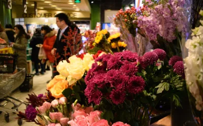
We are back from the PMA and we are excited to talk about the experience. In so many words, we really enjoyed ourselves. Here are three big takeaways from our time at the PMA convention.
Foil Is The New Black
Everyone loves fall colors, but sometimes earthy tones need a little pop. It’s crazy what a little gold foil can do to make patterns jump out. We’ve found that foil is a natural fit along pastel colors and delicate lines and elegant script. From what we’ve observed around the PMA and elsewhere, people are catching on the gold foil trend and it looks amazing. Take a look at this packaging accented with gold foil from an artisanal bakery. That elegant pop you’re noticing in the bakery packaging is exactly what we’re getting at. But, we will say this: with foil, less is always more. Too much gold foil and you may be channeling a little too much Flavor Flav, but if that’s your thing, we absolutely respect that.Water Colors Are Magical
Being an informed consumer of quality design, no doubt you’ve noticed that the watercolor aesthetic is undoubtedly in. The fusion between classic paint strokes and modern design makes for something super pleasing to the eye. Designers are subtly moving away from watercolor as a somewhat passive tone, and embracing watercolor as a bold technique. Check out this beautiful packaging from a confectionary brand called Cacao Barry. The watercolor aesthetic gives off an authentic, honest, yet cultured effect. While the vibrant colors and abstract imagery create a sort of mesmerizing effect. Needless to say, we’re big fans.Floral On The Go!
This is something we’re super excited about. Have you ever purchased a plant as a gift for a friend? Chances are if you have, carrying the plant around was rather cumbersome and a little awkward. Everyone is looking for products that are easily accessible and transportable, and plants should certainly be no different. Others are catching on the trend, which means someday we’ll live in a world where all packaging looks great, and is easy to carry! That’s why our Carry On floral packages were such a big hit at the PMA. The idea was to create packaging that makes plants mobile, but does so with a cool design that almost feels like you’re carrying a new purse. We’re happy to say we think we hit the mark. As you can tell, attending the PMA was an awesome, eye-opening experience. Seeing all the different designs and trends definitely inspired us for future projects. We’ll make sure to keep you posted as we embark on new design journeys, and we hope that you can join us!
We are back from the PMA and we are excited to talk about the experience. In so many words, we really enjoyed ourselves. Here are three big takeaways from our time at the PMA convention.